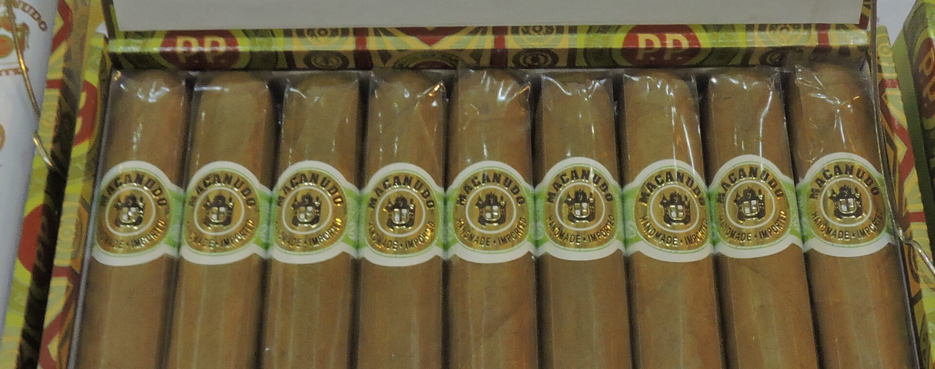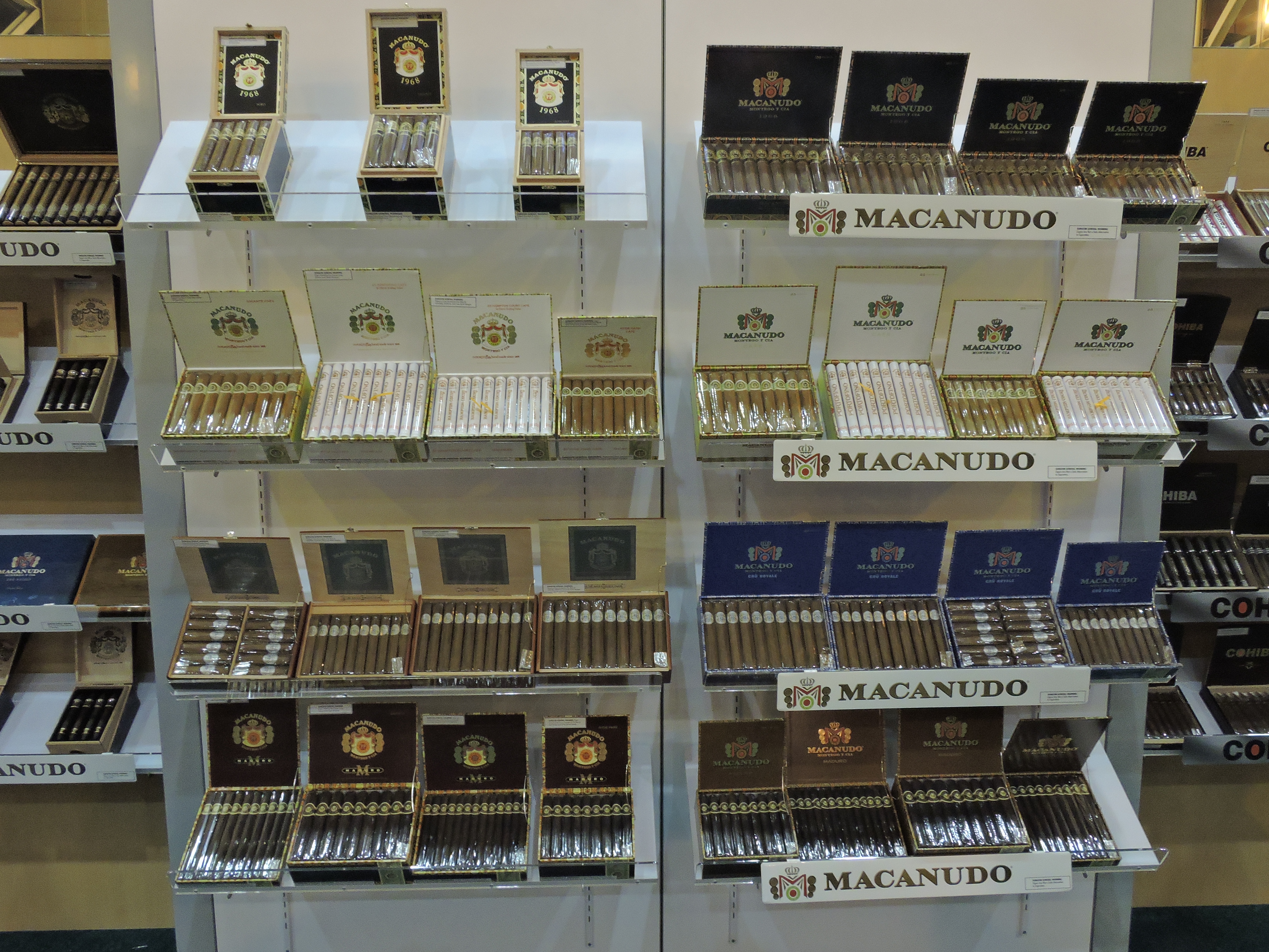
At the 2015 IPCPR Trade Show, General Cigar showcased a preview of a new look for its Macanudo line. The new look for the line includes a new logo, revamped packaging, revamped lines that will create a more consistent look across the portfolio.
In 2013, Macanudo celebrated its 45th anniversary. It was at that time when the brand started to think about what things would look like ahead for the next half century. It was about 18 months ago, when some extensive consumer research was done and that was used as input into the redesign of Macanudo.
A big change that will be seen across the line is a new logo. The idea with the new logo was to stay true to the roots of the band, yet project a more contemporary spin. The new logo incorporates elements from the old logo such as the crown, coins, and bold letters of the name “MACANUDO”. At the same time, a bold “M” replaces the M-shaped draped design.
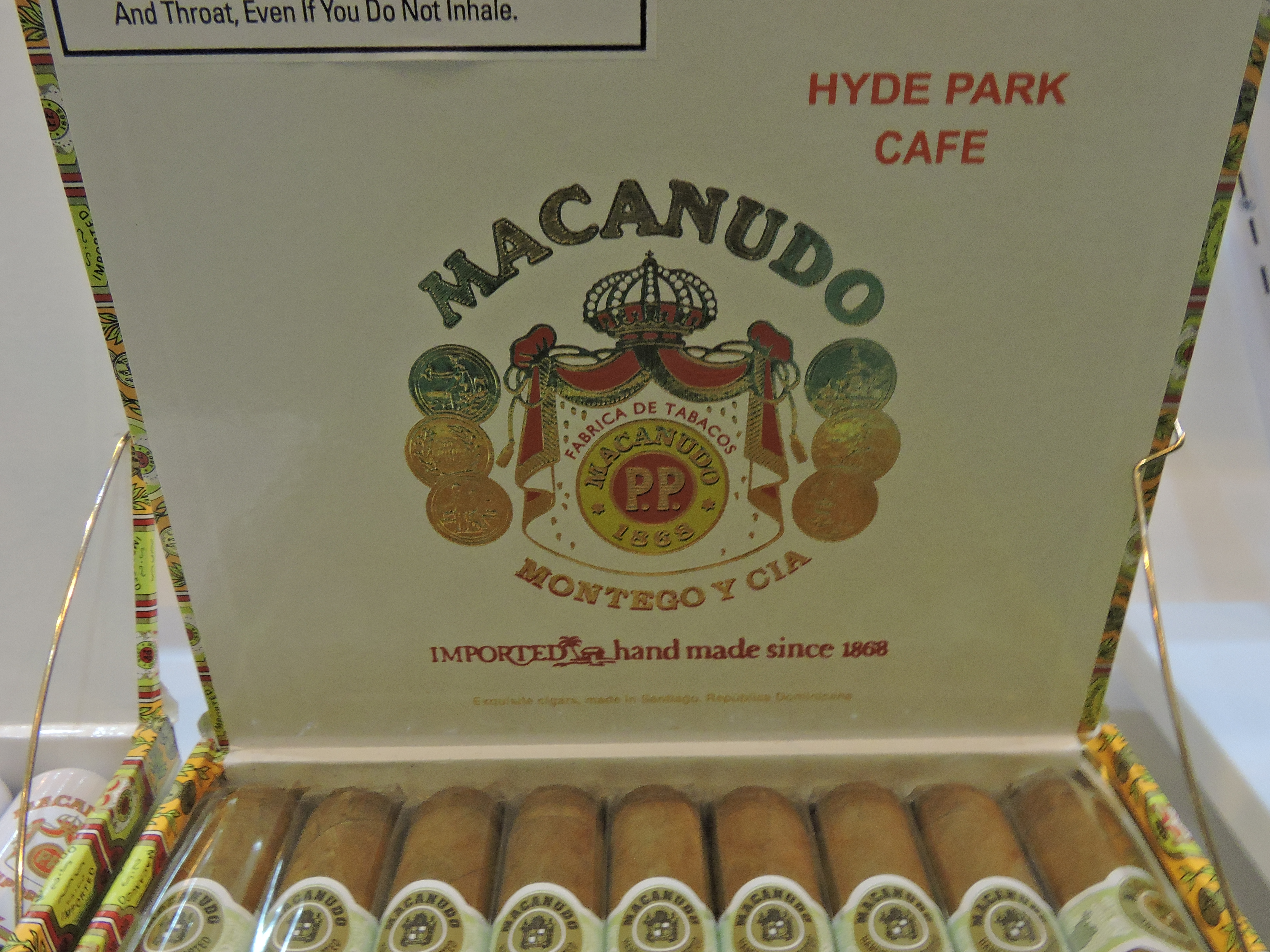
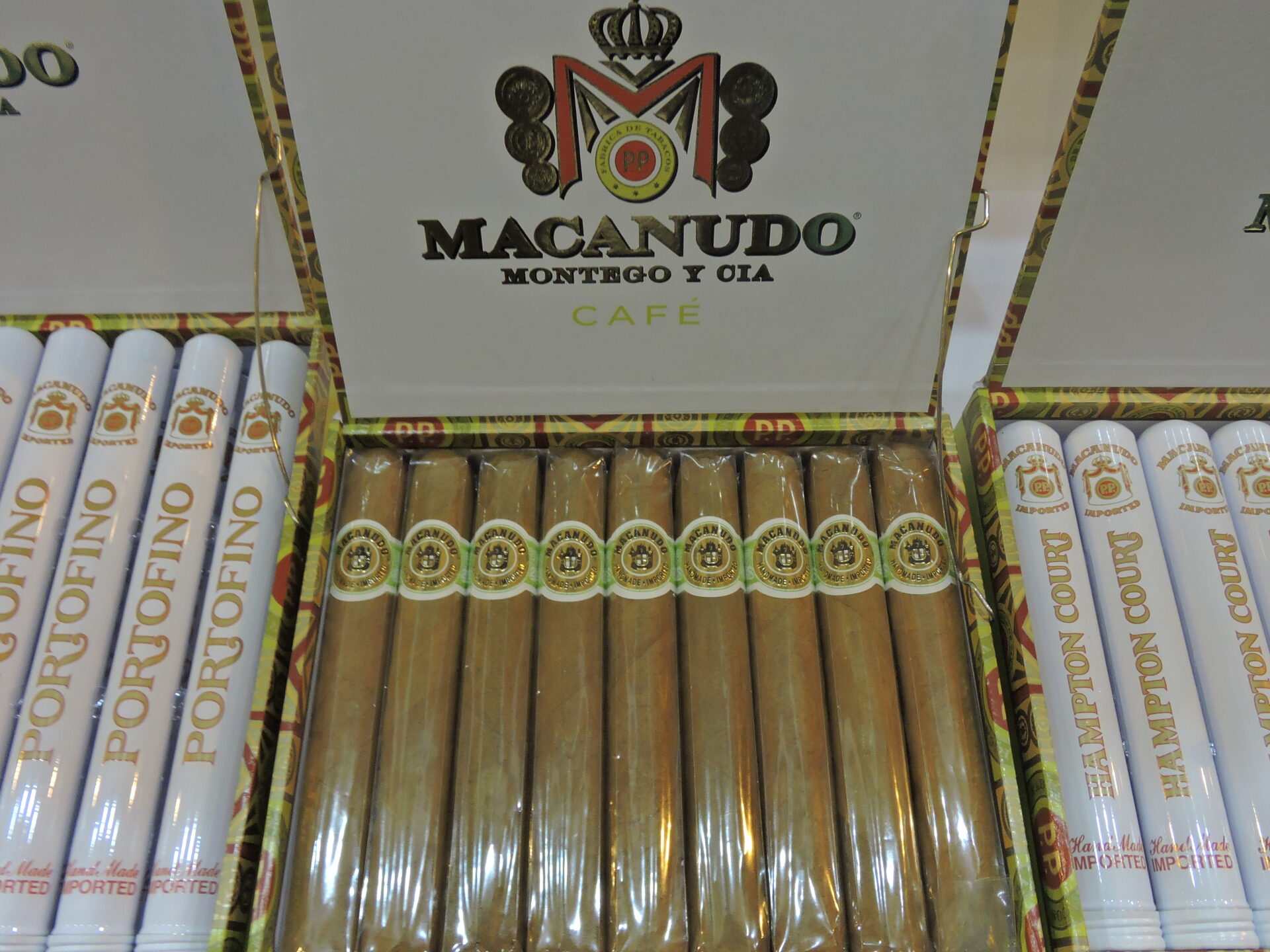
In an effort to create consistency, the new logo has been applied across the various lines under the Macanudo brand. At the same time, the regular production lines will now have wrap-set boxes. Each now features a solid colored background to identify the brand along with the new logo. The Macanudo 1968 sees a big change here as the cabinet boxes are being converted to wrap-set boxes. To a lesser extent, the Macanudo Cru Royale sees a significant change as well.
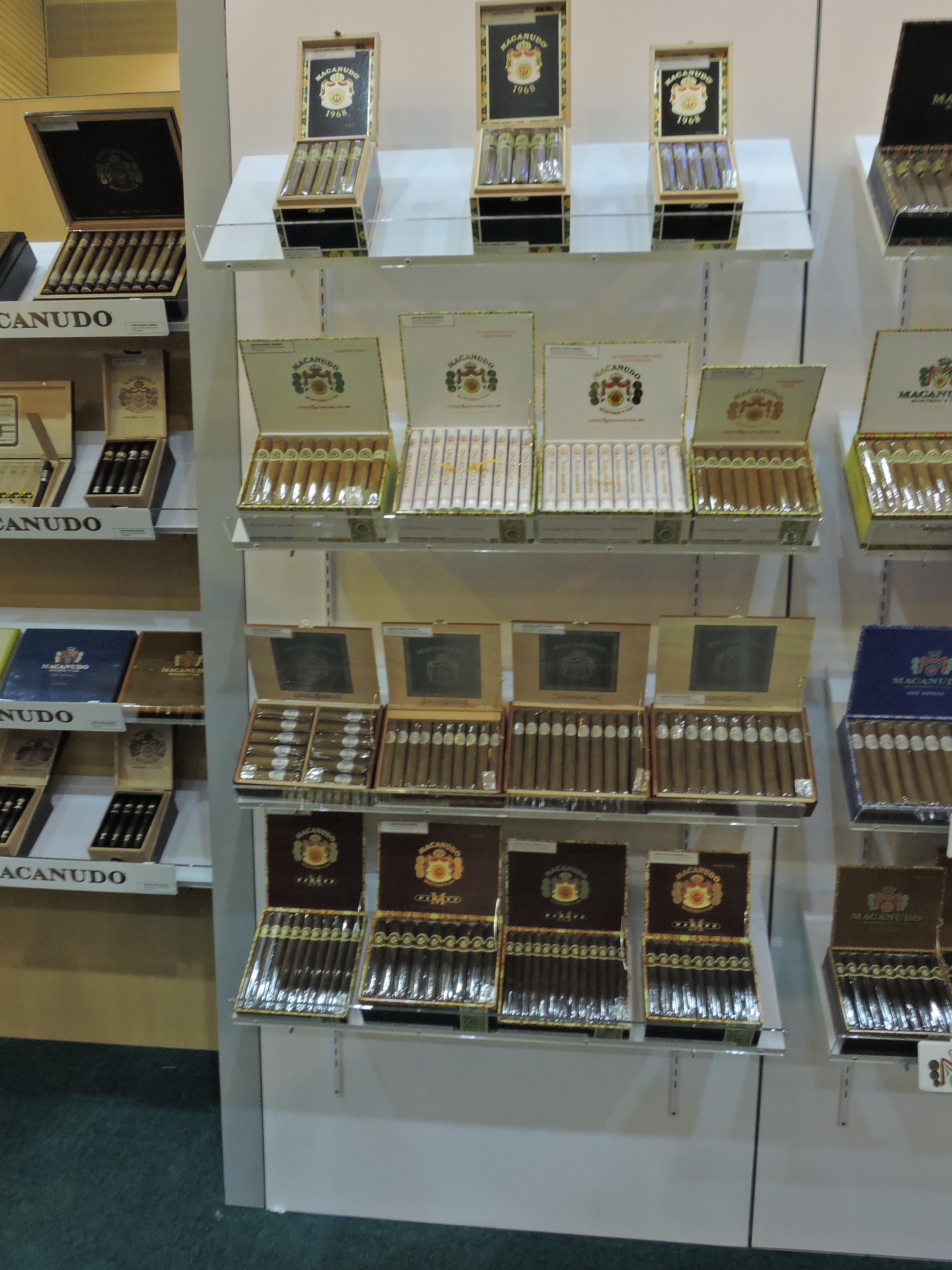
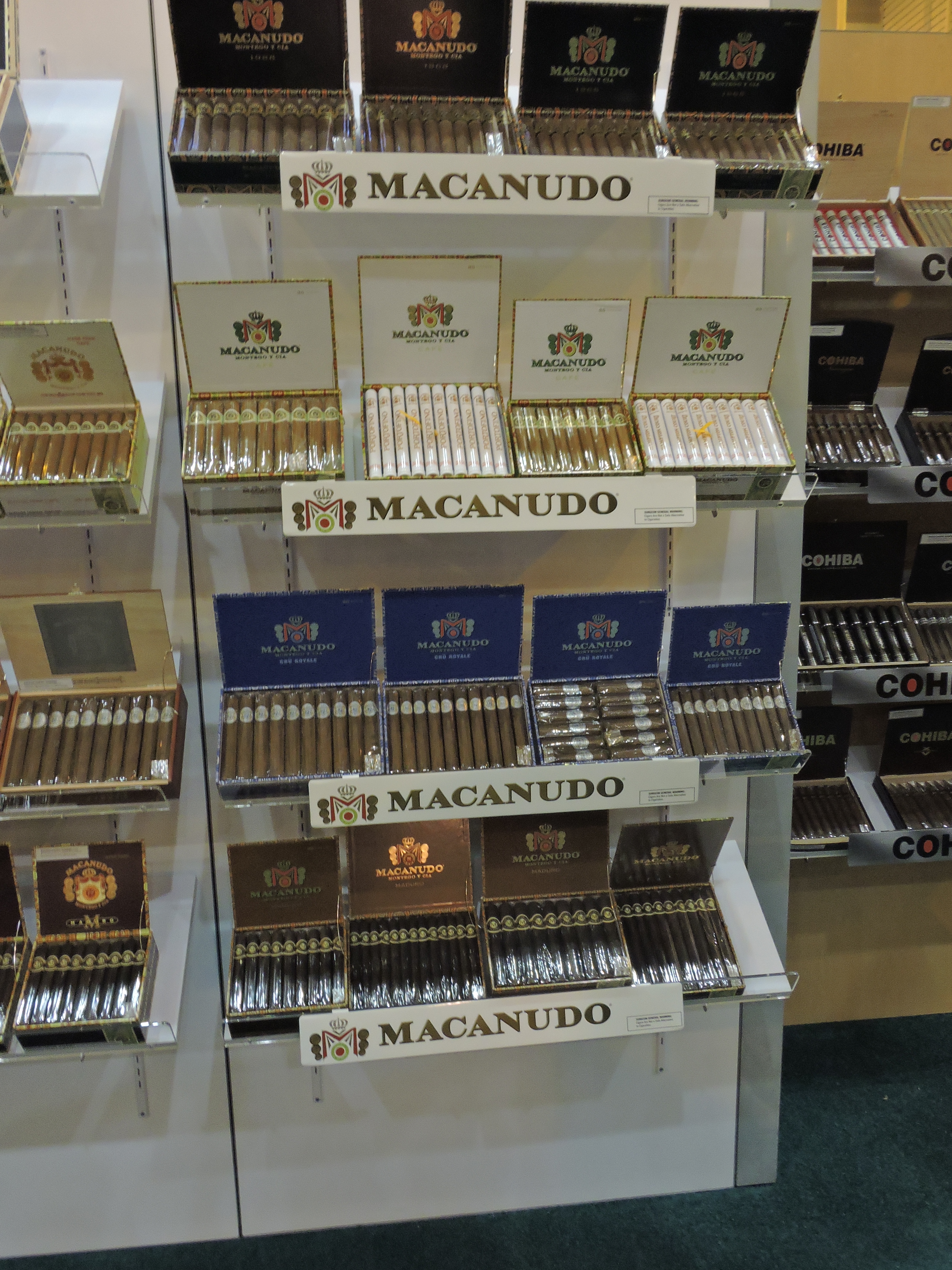
There will be upgrades to the bands as well. Most notably, this is seen on the Macanudo Cafe, which now incorporates an eye catching, gold-foiled band.
Plans are for the new redesign of the Macanudo brand to roll out in the early part of 2016. This will allow the inventory featuring the old package to be exhausted. Macanudo plans to support the redesign with a comprehensive communication and marketing campaign.


